
CREATION OF AN ONBOARDING PORTAL FOR SABRE’S DEVELOPERS AND ENGINEERS.
MargotCommunity is an inclusive online network helping women and gender-marginalized individuals find mentors and provide virtual 1:1 time with them.
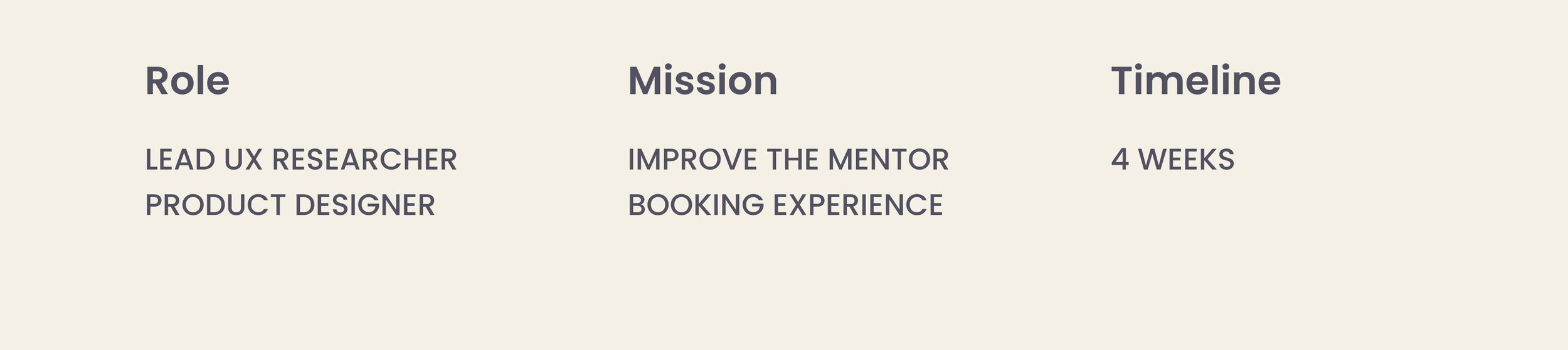
The goal of this collaboration was to improve the experience of booking a mentor on the MargotCommunity website, with a special focus on the mobile experience.

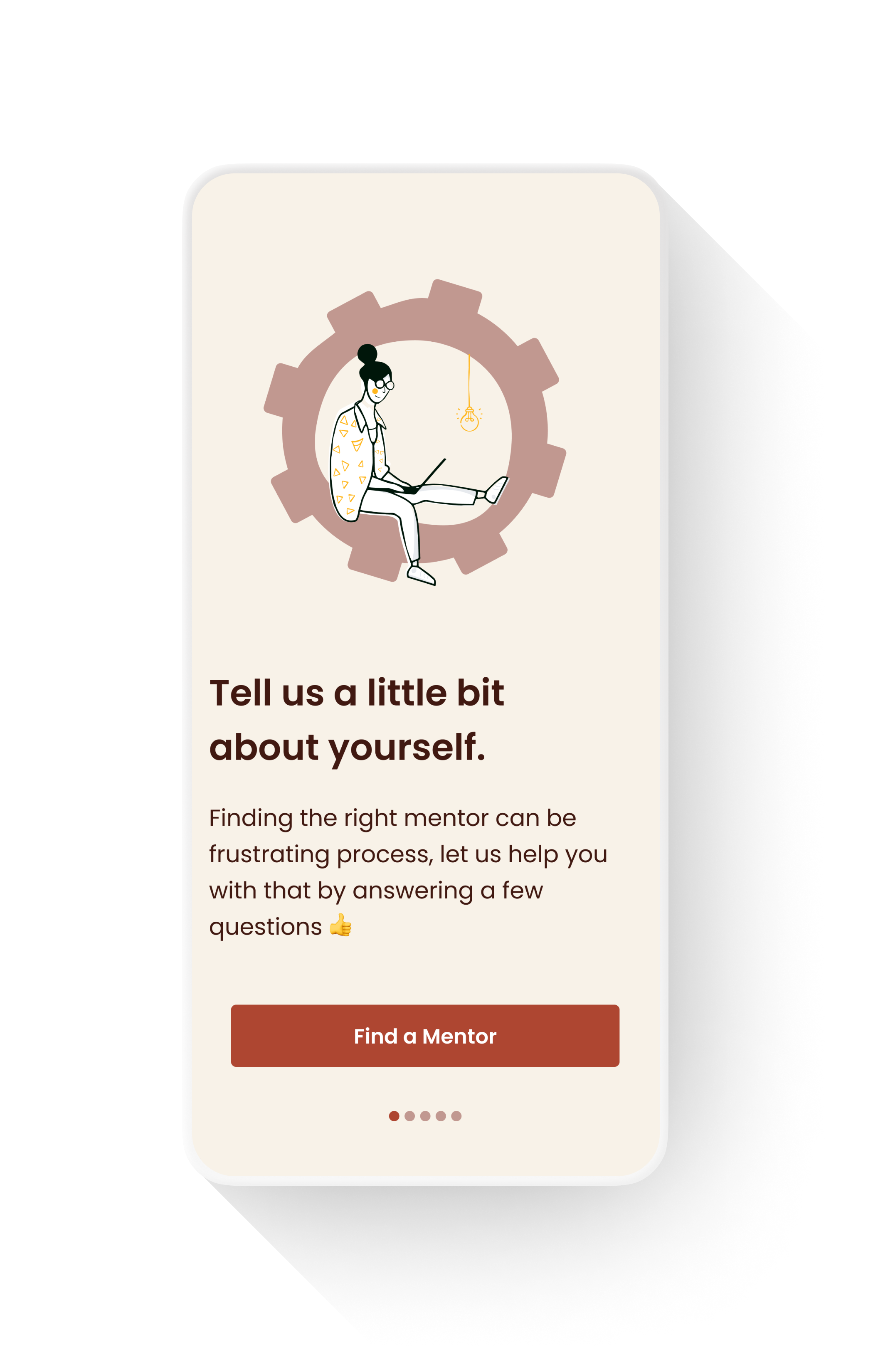
Tailored Onboarding
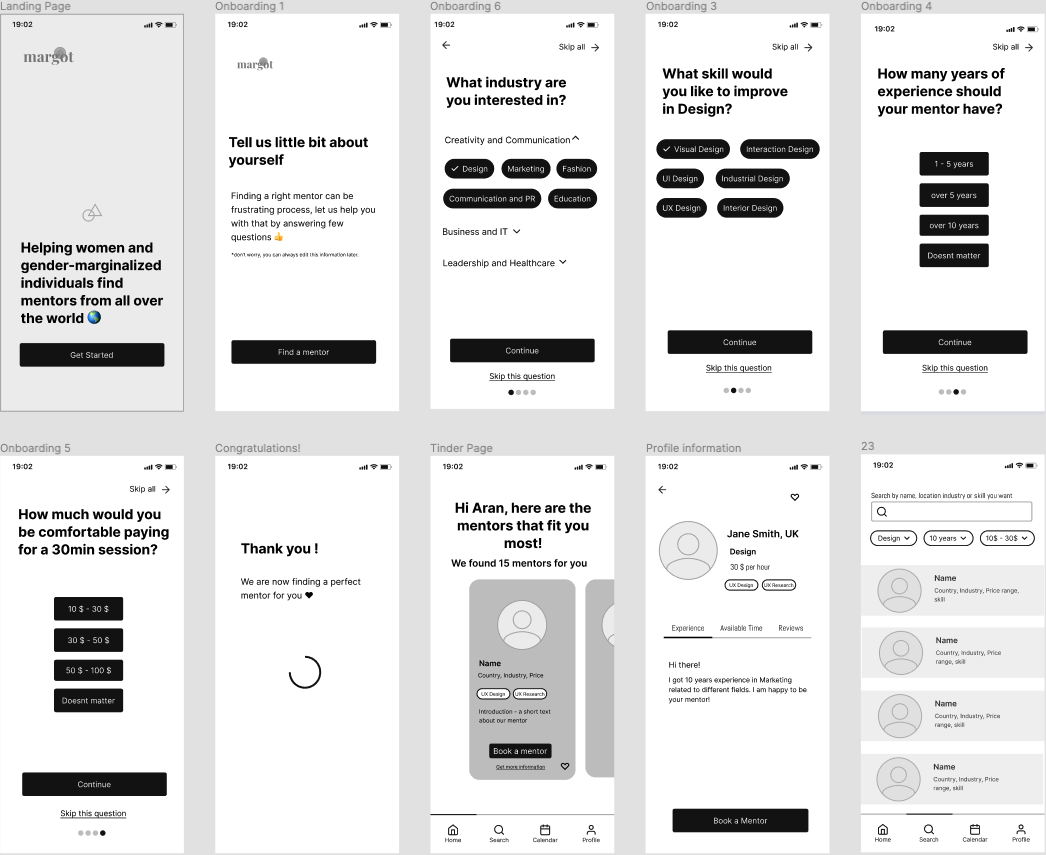
In this onboarding we added customization screens, all relating to the App’s content.
The idea was that answering personal questions would further involve the user and already create engagement with the App’s content.
Walk-Through

MargotCommunity is an inclusive online network helping women and gender-marginalized individuals find mentors and provide virtual 1:1 time with them.

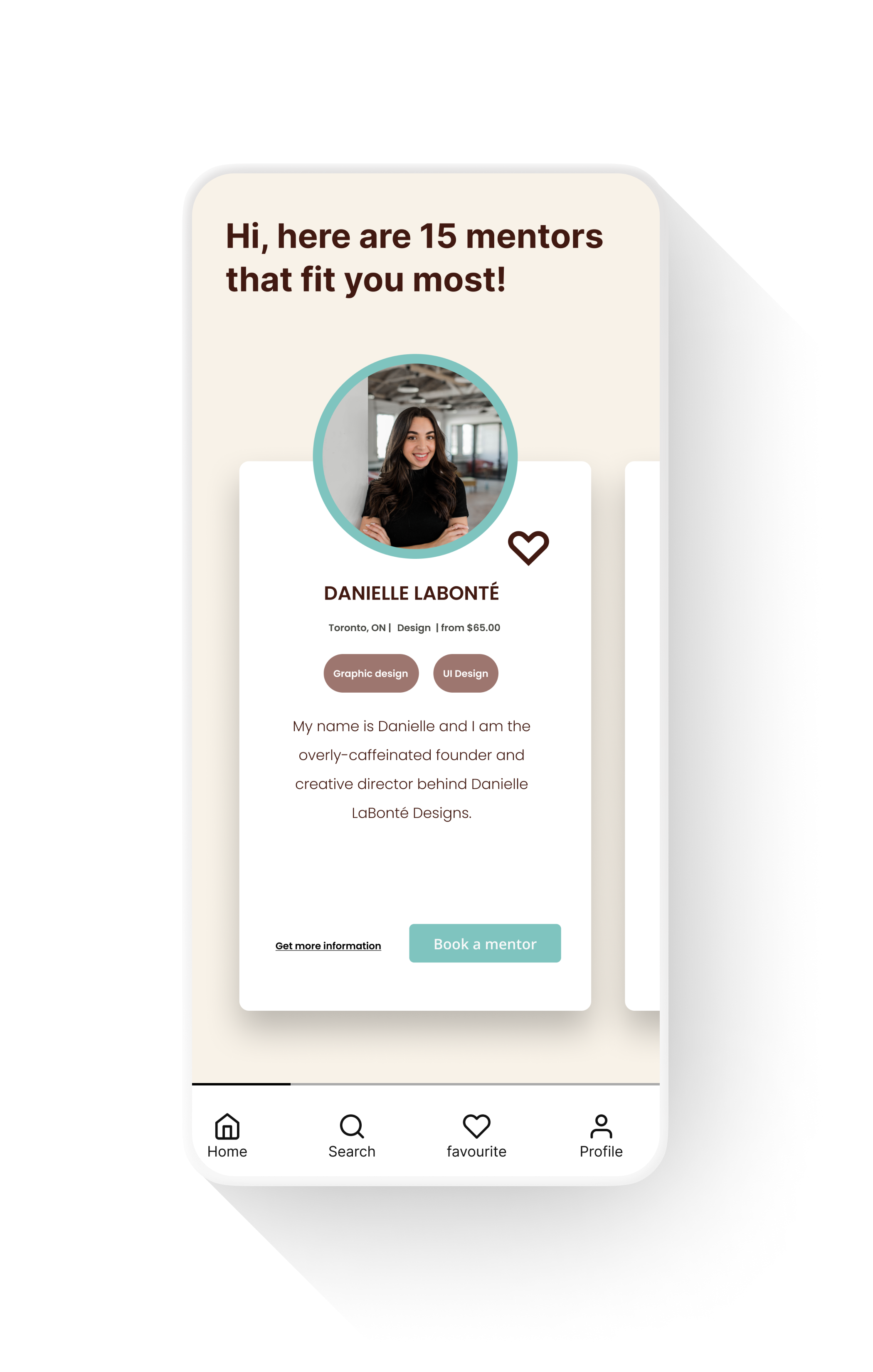
When booking a mentor, potential users have to find a mentor through an inefficient filtering system that does not allow them to add multiple filters at once, which in turn causes users to get frustrated and give up the whole process.

We believe that improving and simplifying the searching and filtering process for users will improve the overall user experience and increase the number of bookings.

An onboarding questionnaire to create a more tailored experience. Turning the filtering system on its head and asking the user who they are, instead of who they are looking for.

Methodology
Design Thinking.
METHODOLOGY
DESIGN THINKING.
Research
Now although the main complaint we received from developers regarding their onboarding was how long it took, we’ve been able to break this one element down and identify 4 main underlying pain-points. Once addressed properly these 4 elements would increase the speed of the overall onboarding and download of S2E.

QUESTIONS AND OBSERVATIONS
To help me better frame any problems with the product, I began by forming some questions and observations I have about the product. To easily document these I followed the structure [situation], [response], [problem to business or experience] to ensure I'm aware of users and business needs.
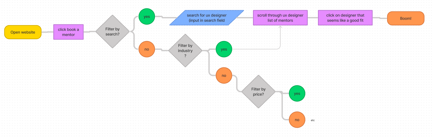
When booking for a mentor, users have to find a mentor by selecting one filter at a time, then going back to the main page to use the next filter which is time-consuming and which causes potential users to get frustrated and maybe even give up.
ASSUMPTIONS
USERS GOAL BUSINESS GOALS
We believe that improving and symplifying the searching and filtering process for users will improve the overall user experience and increase the number of bookings.

USER SURVEY
To confirm my observations and begin forming a hypothesis backed by data, I created a user survey to uncover the core problems with the product that I could prioritize for user and business needs.
We decided to do a market study instead of a user study, meaning we created a survey to send out to non-users in order to understand what they would look for in a mentor, and in a mentor booking platform.
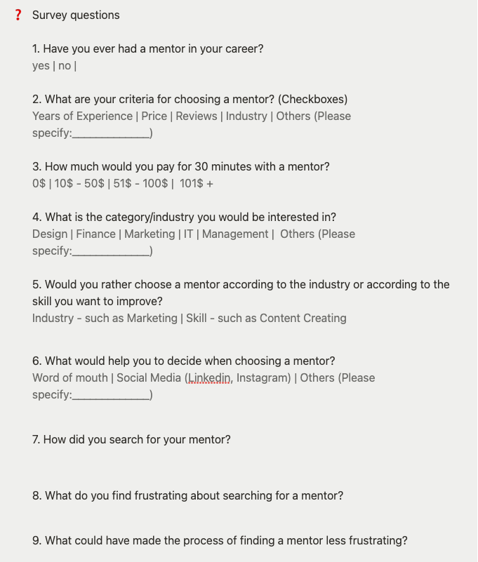
SURVEY QUESTIONS
I prepared a series of open and close-ended questions.
SURVEY RESULTS
-

“Finding a good match is the most important factor - find person with skills I need, in exact industry, same state of mind”
UX Designer
-

“Having an easy to read portfolio of a mentor's expertise”
Founder
-

“I'm looking to up my skillset within my field so what's really important for me is actually to have an easy way to find out what skills they have, like Photoshop, animation, etc”
Visual Designer
Research Findings
Having shared my survey with users of the product, the next stage of my case study was focused on synthesizing the data to recognise trends and form a hypothesis. During the synthesis I segmented user responses and used an affinity map to prioritise the problems of users in line with the business needs.
SURVEY RESULTS
The majority of users we spoke to were sent a word document or equivalent during their first daily, or in an email by their manager.
First off, we brought our survey results over from Typeform into Notion in order to appropriately tag responses and begin identifying trends and key words. See some example quotes in above section.

AFFINITY MAP
Once we had our key words we were able to create our affinity map in Figjam.

VALIDATED OBSERVATIONS
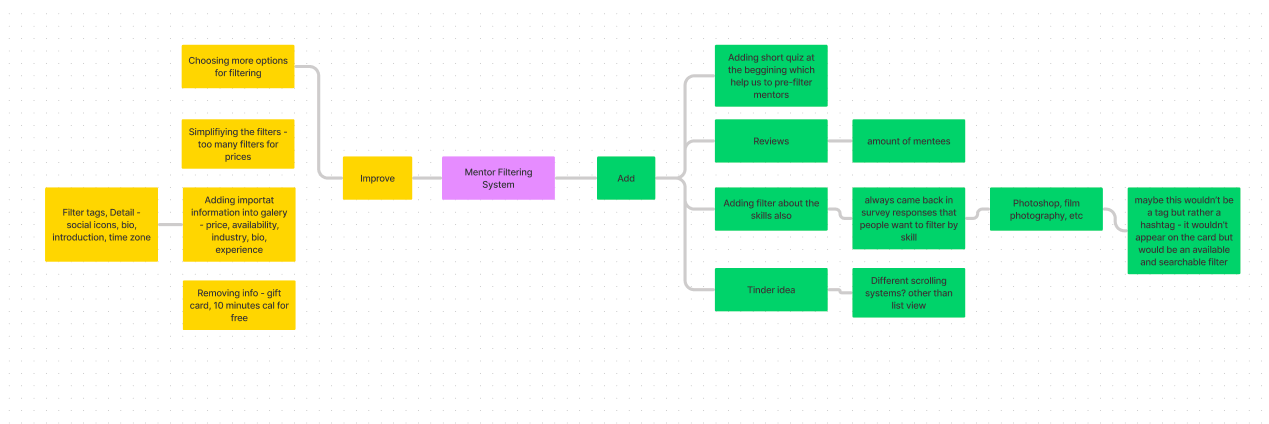
At this point in our research, we've narrowed down our field of focus from wanting to improve the overall booking experience to specific pain points we need to focus on moving forwards. Our survey has showed us the importance visibility (seeing all the mentor’s information quickly) and the difficulty of finding the perfect mentor, especially one with the same skills.
So how might we create a filtering system that allows potential mentees to quickly find a mentor that matches their exact needs?
To avoid following the first idea I conducted a series of ideation techniques. This allowed me to consider an array of solutions. Following ideation, I mapped what could be improved or added to the product.

VALIDATED OBSERVATIONS
Even though we had initially wanted to focus on redesigning the current filtering system, our survey results showed the most important thing for our target users is to quickly find a mentor, ie they don’t want to spend too long searching or filtering through a long list.
There were two solutions that stuck out to us when ideating. The first was the idea of an onboarding quiz that would ask a few simple questions to our users, allowing them to feel involved in the process of finding a mentor while also not overwhelming them with options. By the time they arrive in the App they are already being shown a tailored list.
The second was the idea of the Tinder swipe as we called it. Essentially, creating a full-screen scrollable carousel of each mentor, thus increasing the visibility of each mentor’s skills, industry, prices, right from the homepage in order to save time.

This is the only information available for each mentor with the current web design (without clicking)
1 - User Flows
USER FLOWS
Following Ideation, I created user flows of the existing experience and improved the flow based on the idea that fit with business and user goals.
Ideation
1 - Validated Observations
MID FIDELITY WIREFRAMES
I used a neutral color palette to avoid any decision bias and would use this prototype to get feedback internally. I used Autoflow in Figma to help me easily map the user flow between each page ahead of converting the pages into a prototype.

After discussing with my other team members, we decided this initial iteration of our onboarding questionnaire felt too quiz-like and formal.
So I went in for the second iteration, with the goal of making the questions seem more interactive and informal.
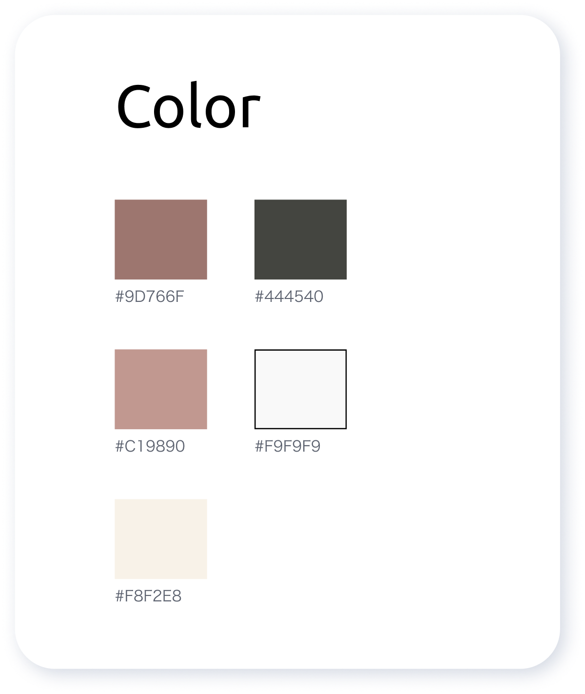
1 - Styles & Components
STYLES AND COMPONENTS
The lo-fi prototype helped me recognize frustrations with the experience that I improved at the hi-fi stage. To create the high fidelity prototype I inspected the product's style and followed the 8pt rule to effectively and easily create a prototype that was consistent with the product styling. Before creating the prototype I defined styles and components to easily and quickly help me design consistently


Design
PROTOTYPE
Testing
With the hi-fi prototype created I formed a testing script with scenario and tasks for the user to complete to validate the prototype with real users. To test the prototype I used Maze and gathered feedback following every task.
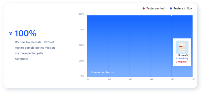
The first task focused on the Onboarding part of our design and proved to have a 100% success rate.
However, the second part of the test focused on the swipable mentor cards. Two users got lost at this point and didn’t realize the cards were swipable, and we can’t have that happening! So I decided to implement a quick and easy change to the final design in order to prevent this confusion from happening.

And with that last change, this Case Study is concluded!
As a team, we identified the pain points in Margot’s web booking experience, conducted initial research, had multiple ideation rounds, moved onto our wireframes, finally ending with the high-fidelity prototype that we sent off for unmoderated usability testing.