
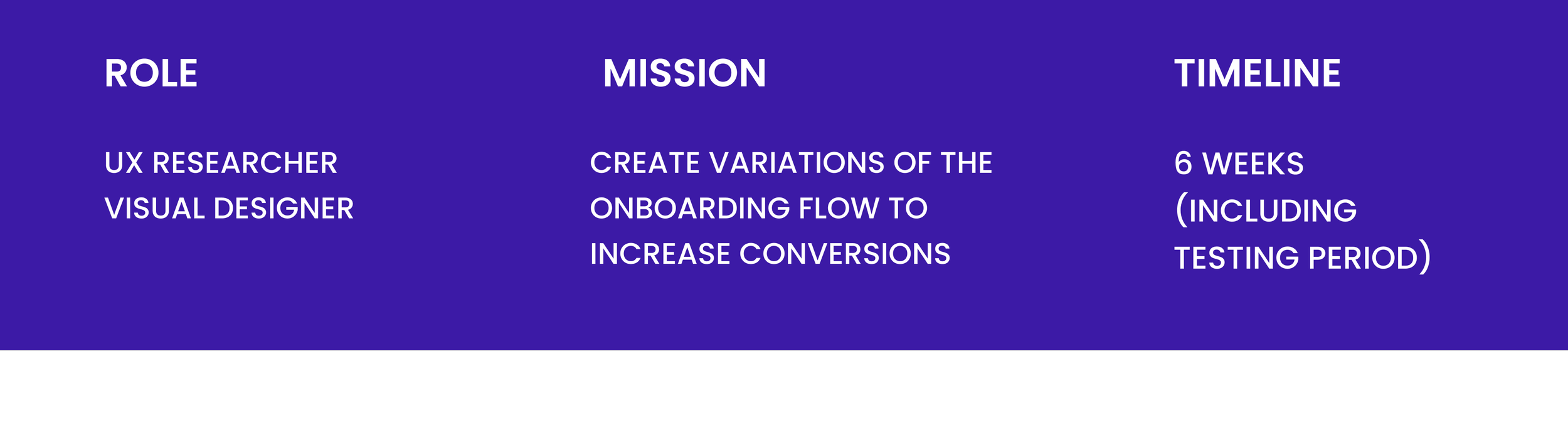
AUMIO SLEEP AND RELAXATION APP ONBOARDING OPTIMISATION
Aumio is a meditation and audio-storytelling app for children (think headspace but for kids). It is freemium based and like many other Apps the user is taken through onboarding screens after initial download. We wanted to play around with the length and content of these onboarding screens in order to increase the number of sessions completed and decrease the drop rate.

Research Process
Before jumping straight into designing new onboarding screens, we wanted to make sure our internal goals were aligned with our user goals, in order to create designs that are tailored to meet users' requirements and deliver intuitive experiences. Without conducting UX research beforehand, we risked creating solutions that don't align with user expectations or fail to address their pain points, resulting in a poor user experience.
GOAL ALIGNEMENT
Because Aumio is a small team getting everyone in the same room to brainstorm ideas together is not too difficult. We like to include founders, developers and creatives all together in these sessions, in order to make sure everyone is aligned and reduce the back and forth.
We began with writing down all features or elements we wanted included in the onboarding process. We stuck these up on the wall on post-its because we love post-its.

USER FEEDBACK GATHERING
Once we’ve aligned on what the team wants from these new onboarding flows, we wanted to make sure we took into account our user feedback.
Aumio has a Golden-User Program which consists of a constant feedback loop with some of our star users. This means we are constantly receiving feedback about any feature rollouts, content, and App UI. Therefore, we did not need to perform any specific research for this project, we already had feedback about the onboarding process from our existing users and would keep this in mind as we moved forwards with our designs.

TEAM WORKSHOP
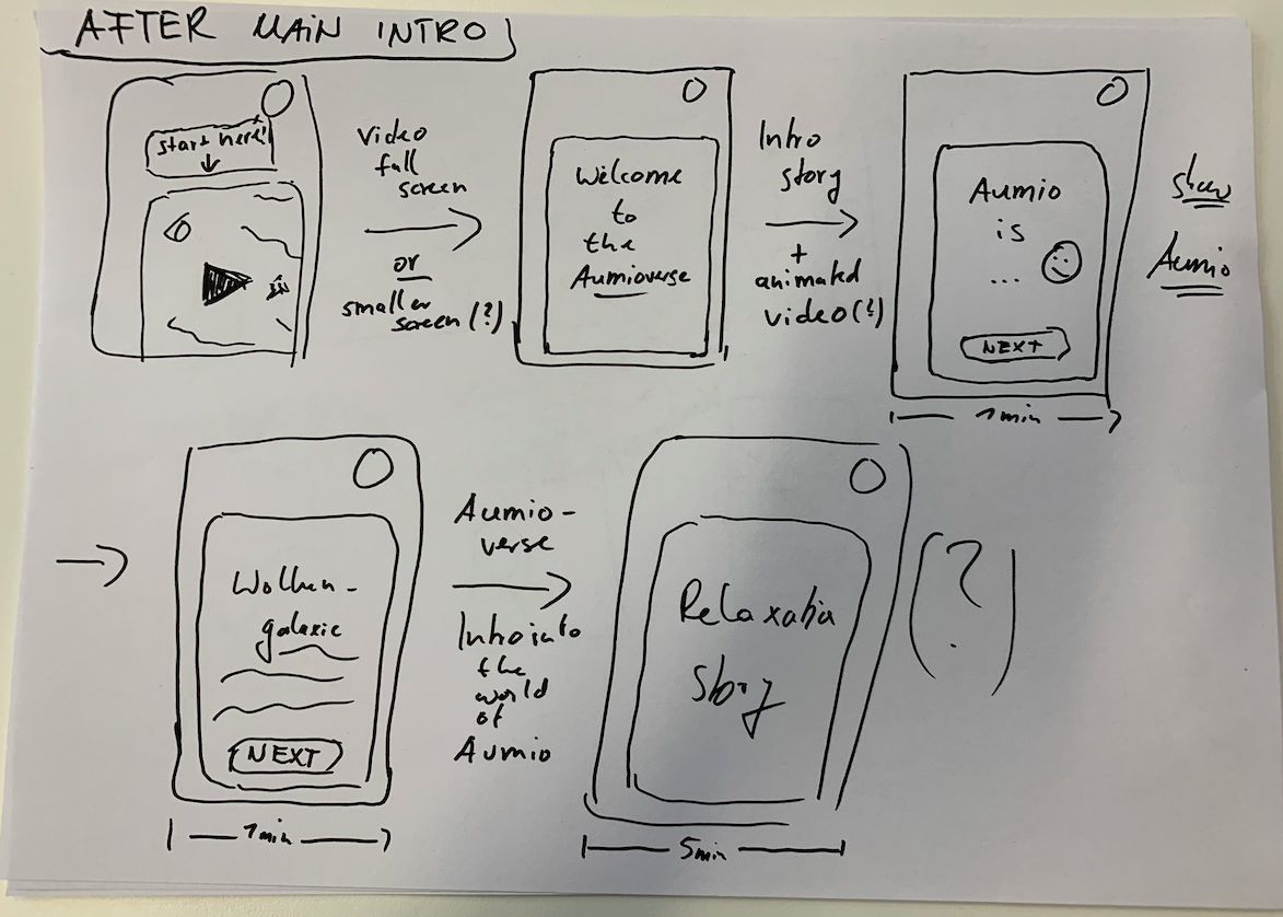
Our last step was to perform a team interactive workshop where everyone needed to draw quick wireframes walking us through the onboarding concept they thought could be the solution to our problem.
These concepts were able to be more focused thanks to our previous alignment on goals and user feedback.


Workshop Findings
-
Short Onboarding
-

Customized Onboarding
-

Playful Onboarding
RAPID DESIGN AND IMPLEMENTATION
After collecting the team’s ideas we got to work in Figma, creating 3 different versions of what the team had suggested:
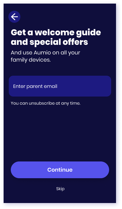
A short onboarding
As indicated by its name, we kept this design extremely short. The idea was that the more information parents have to enter, the less likely they are to complete the process.
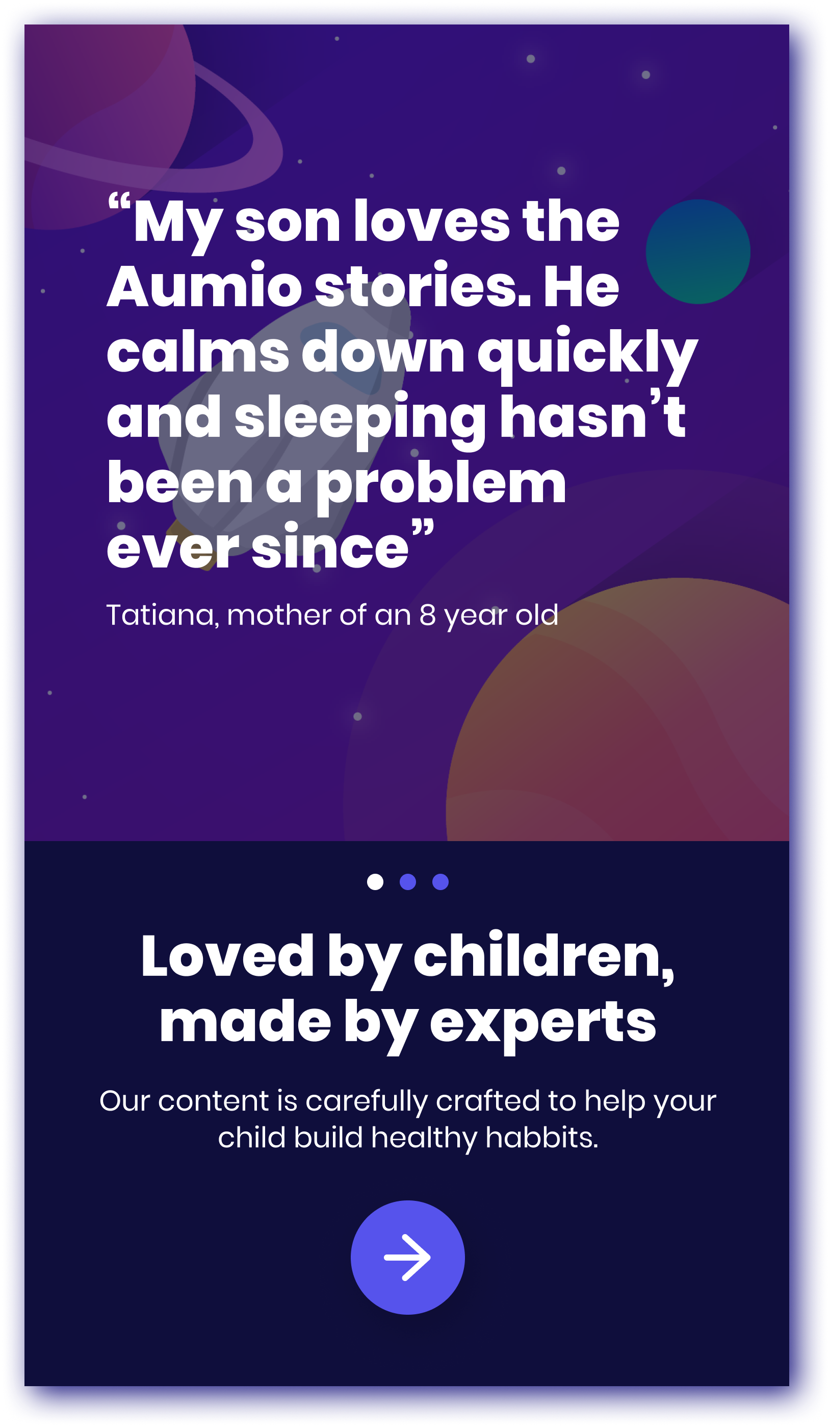
A playful onboarding
This concept was aimed at children directly, with the idea that parents would go through the onboarding process with their kids. If we can engage the kids from the beginning then hopefully, their parents will be more likely to immediately check out some of the content.
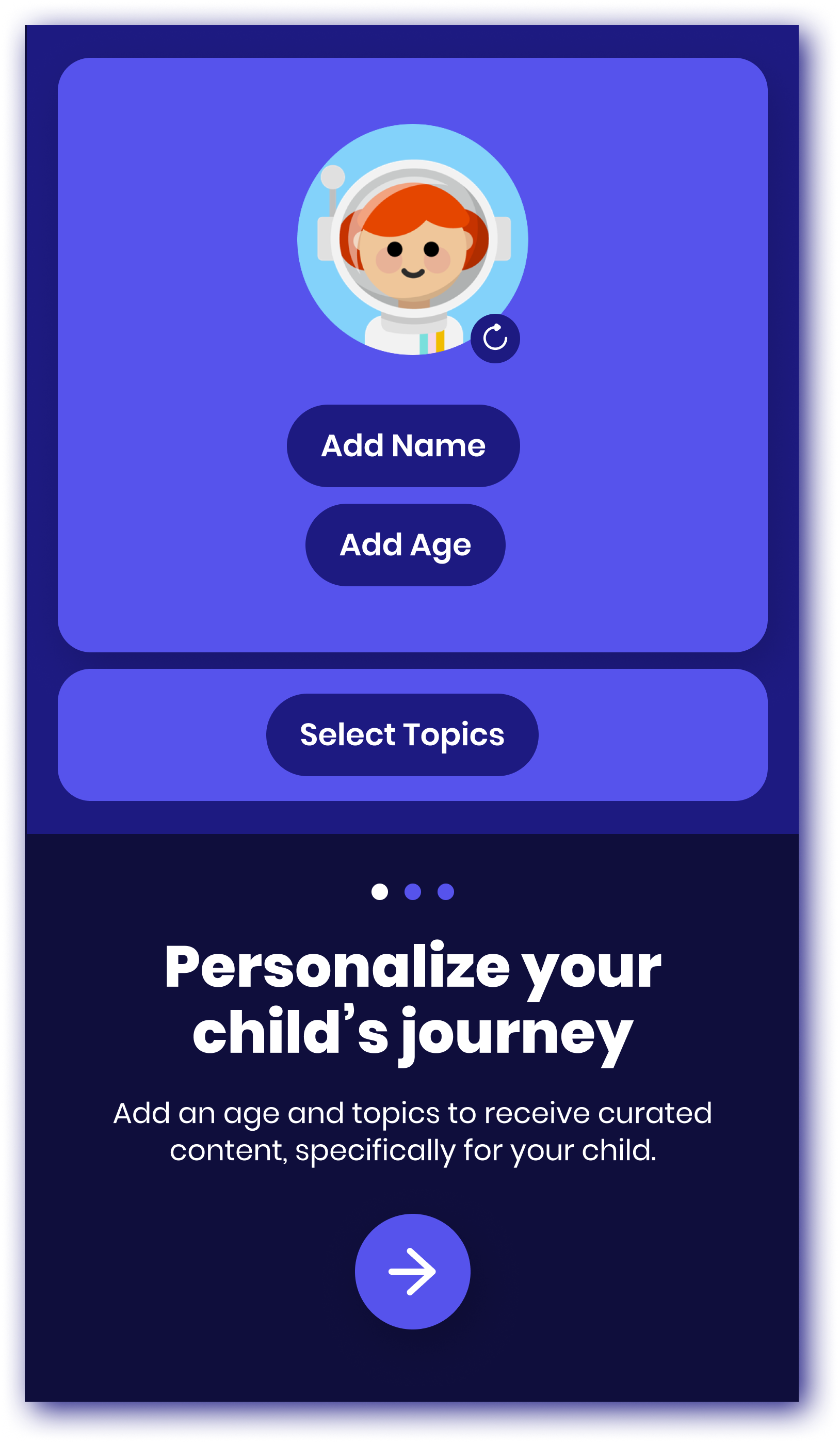
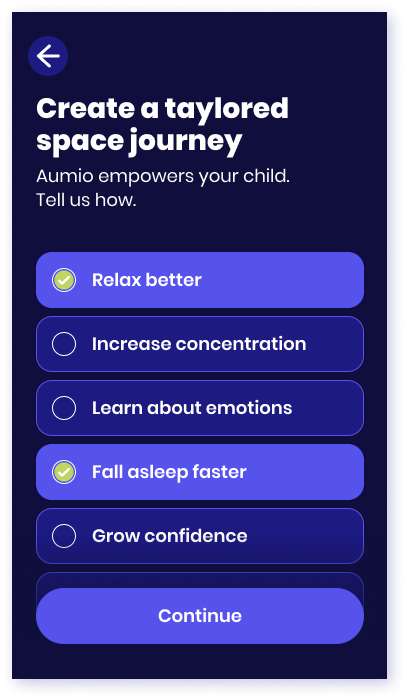
A customized onboarding
In this onboarding we added customization screens, all relating to the App’s content.
The idea was that answering personal questions would further involve the user and already create engagement with the App’s content.
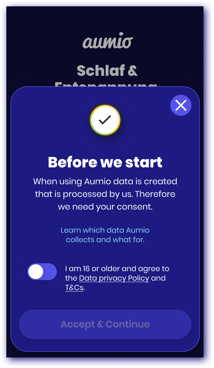
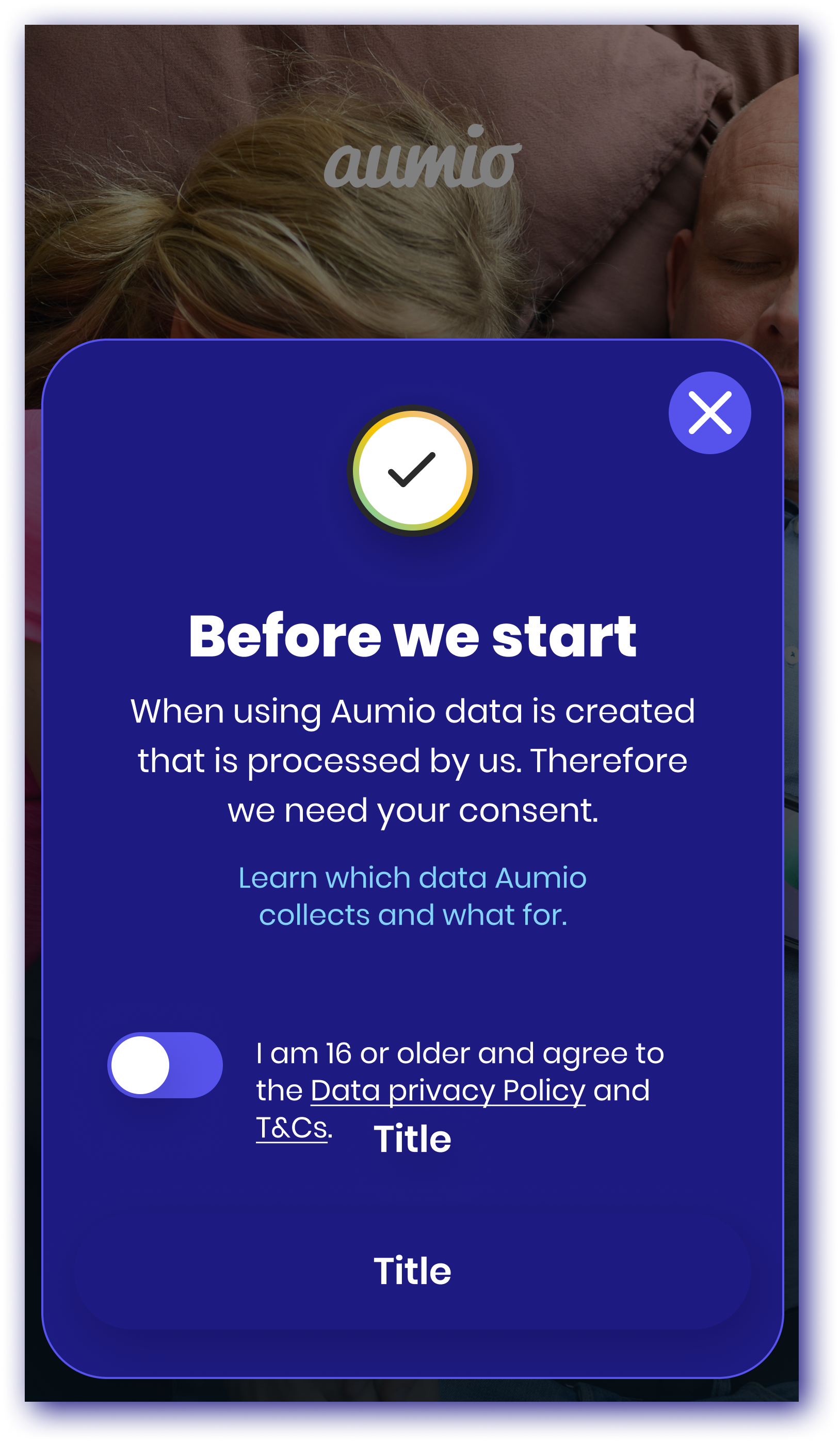
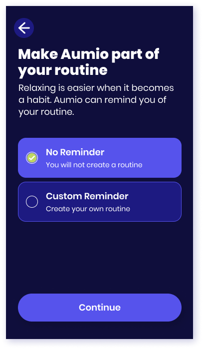
Short Onboarding

Playful Onboarding


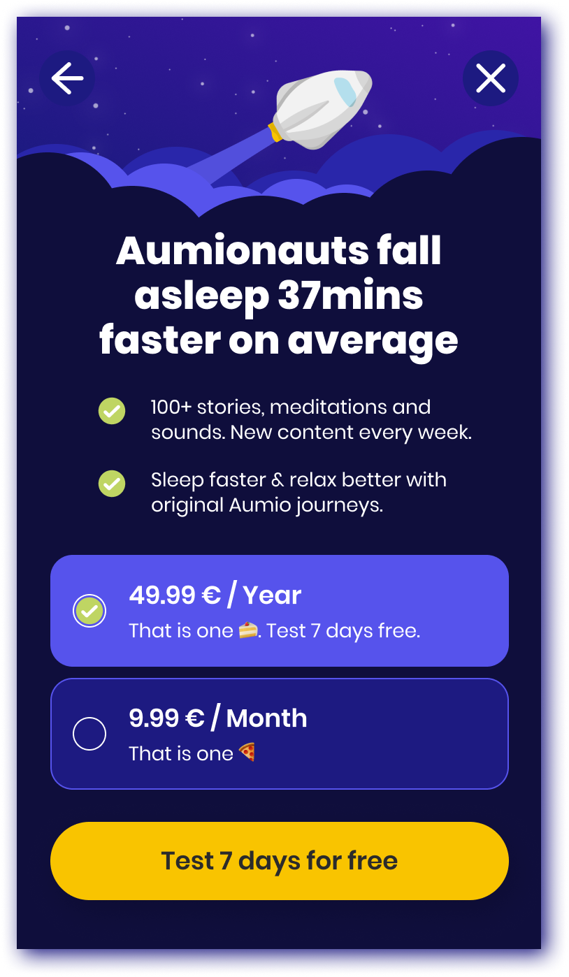
Tailored Content Onboarding
ABC TESTING
We designed these 3 separate onboarding concepts quite quickly without focusing on too many details. The goal was to start testing them immediately in order to see which translated to more first sessions completed.
RESULTS
We let the test run over a period of 6 weeks.
The Customized Content Onboarding resulted in the most first sessions completed (4.5% additional conversion).